
The 70-30 rule is one of the easiest ways to make a room feel put together without a designer's eye. The idea: about 70% of what you see is one thing, and about 30% is something that contrasts with it. It works for colour, and it works just as well for furniture, texture and empty space.
What the 70-30 rule means
Rooms feel chaotic when everything competes for attention, and flat when nothing stands out. A 70-30 split gives the eye a calm base and a clear point of interest. The 70% is the backdrop. The 30% is what you want people to notice.
| Share | Role | Typically |
|---|---|---|
| 70% | Dominant, calming base | Walls, large furniture, flooring, main fabrics |
| 30% | Contrast and character | Accent wall, cushions, art, lamps, rugs, decor |
Applying it to colour
Pick one main colour for roughly 70% of the room, usually a soft neutral or a muted tone on the walls and large pieces. Use a second colour for about 30%: an accent wall, curtains, upholstery, rugs and accessories.
- Neutral base, bold accent: warm white or beige walls with terracotta, teal or mustard accents.
- Tone on tone: a sage green base with deeper green and wood accents for a calm, layered look.
- Dark and light: a deep charcoal or navy feature wall balanced by lighter furniture and brass details.
Keep the 30% accent colour repeating in three or more places, such as a cushion, a painting and a vase, so it reads as intentional.
Furniture and open space
The rule also applies to layout. Aim to fill about 70% of the floor with furniture and leave roughly 30% open for walking and breathing room. This matters in smaller Pune flats, where an overfilled living room feels cramped quickly.
- Choose fewer, better-sized pieces instead of many small ones.
- Keep clear walkways of at least 2.5 to 3 feet between furniture.
- Use wall-mounted and built-in storage to keep the floor open.
Texture and pattern
Use plain, smooth surfaces for about 70% of the room and let texture and pattern take up about 30%. A plain sofa with a patterned rug, a woven jute basket or a textured cushion adds interest without making the room busy.
Room-by-room examples
| Room | 70% base | 30% accent |
|---|---|---|
| Living room | Light neutral walls and a plain sofa | Patterned cushions, a feature wall behind the TV, a statement rug |
| Bedroom | Soft, muted walls and bedding | Headboard wall, bedside lamps, throw and curtains |
| Kitchen | Neutral cabinets and countertops | Backsplash tiles, pendant lights, bar stools |
| Home office | Calm wall colour and a simple desk | Task lamp, wall art, shelf styling |
Bedroom: with and without the rule
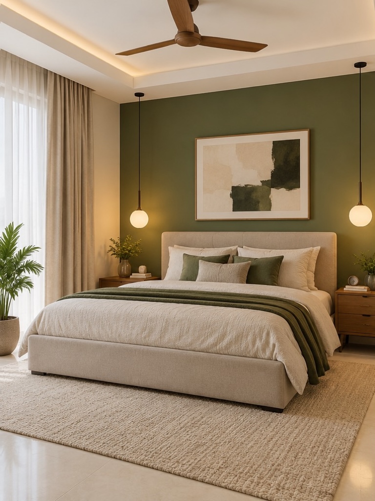
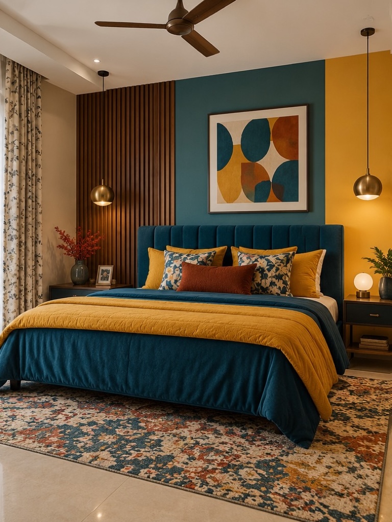
The same bedroom, furnished two ways. The first keeps a calm beige base for about 70% of the room and repeats one olive green accent in the feature wall, cushions, throw and plant. The second mixes teal, mustard, rust and several patterns at once, so nothing is the focus.
Common mistakes
- Treating it as exact: it is a guide, not a measurement. Close is good enough.
- Using three or four accent colours: the 30% should be one or two colours, repeated.
- Ignoring fixed elements: flooring, tiles and large furniture count towards the 70%, so choose them first.
- Making the accent too small: one cushion will not carry a whole room. Spread it around.
How we use it at Tryakshaay
We use the 70-30 rule early in the design stage, when we choose the base palette, materials and layout. It is a quick check that a room has a clear focus and enough space before we move to 3D previews. If you'd like help applying it to your own home, we are happy to walk through your plan.
Prefer a calmer room? See the 80/20 rule, which keeps the base even quieter.
This is a general design guideline, not a strict rule. The right balance depends on your space, light and taste.